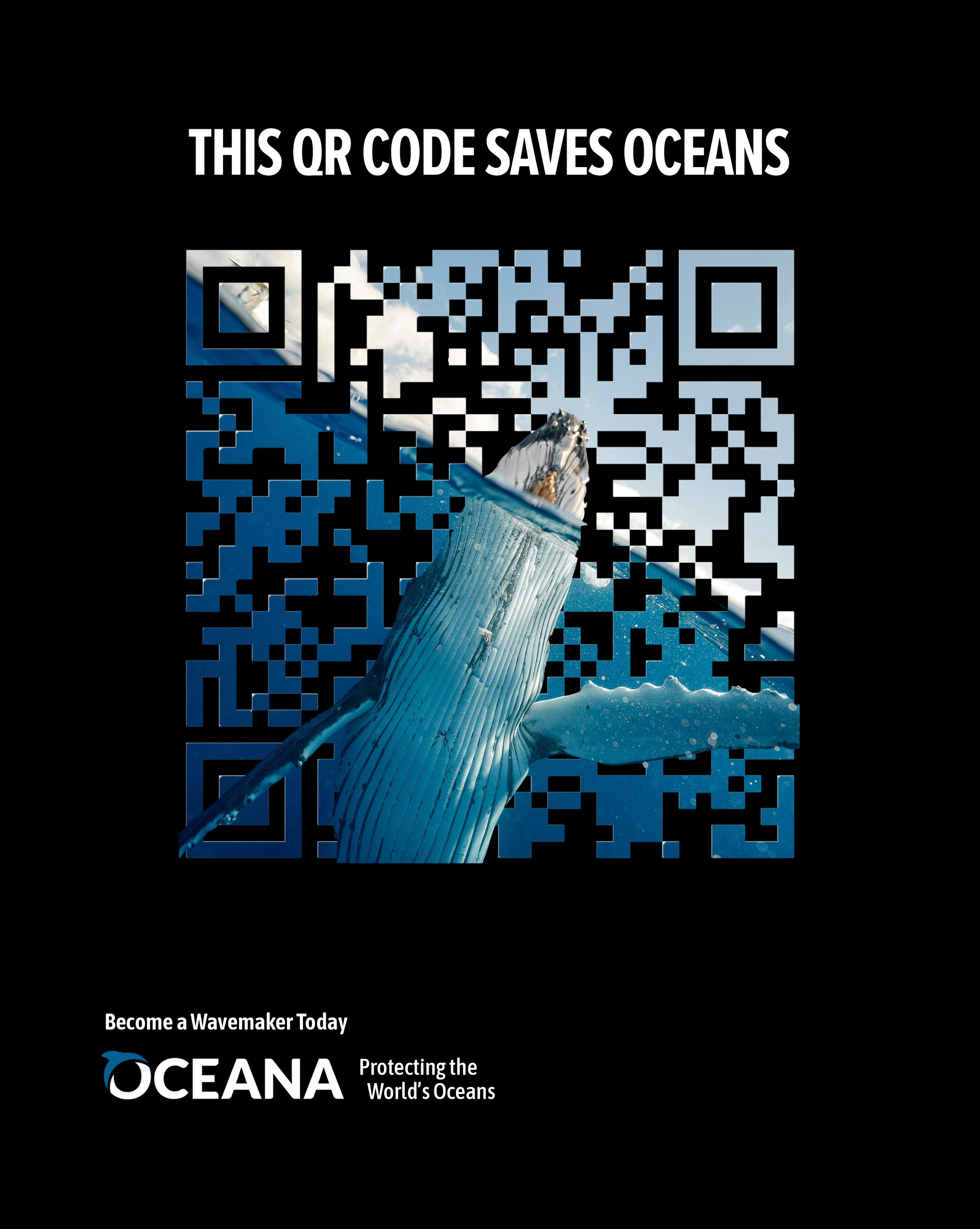
Tear sheet from magazine
Solution #1
Solution #2
OCEANA WAVEMAKER CAMPAIGN
TASK
DISCLAIMER:
It’s not what you think, or is it? My solutions are not an official campaign for Oceana.
For a school project, I was tasked to create two additional advertisements for an existing advertisement campaign. The original advertisement I chose was for an Oceana Wavemaker campaign. The goal was to get people to scan the QR code and sign up to become a Wavemaker, which are volunteers that help keep our oceans clean.
THE PROCESS
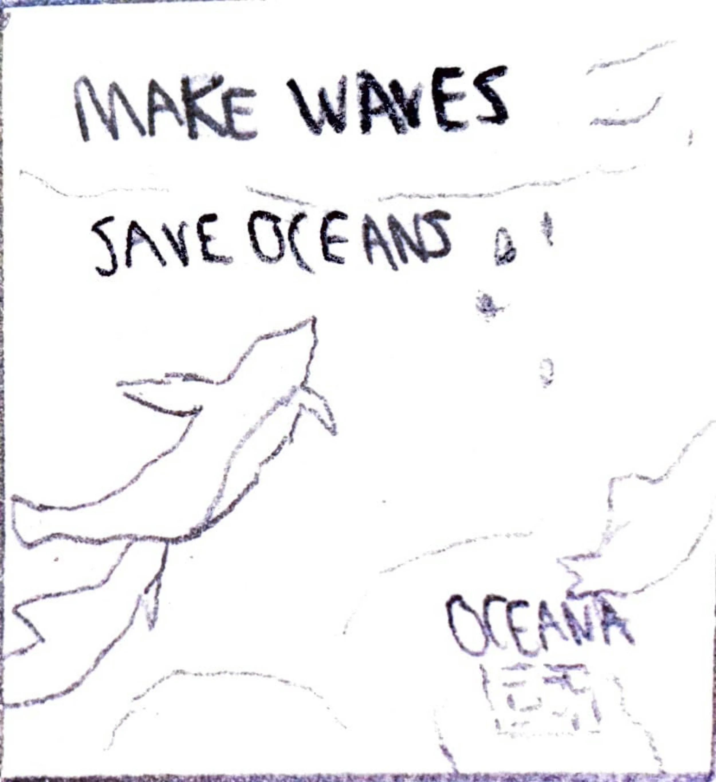
Sketches were a big part of my design process. I wasn’t sure if I should keep the design highly templated or switch it up a bit. I realized after making a couple sketches that I should keep both iterations of the design highly templated to keep the main idea and goal of the original ad consistent across my solutions. Without the big QR code in the center of the image, it takes away the big call to action that the original ad had in place.
Here are some of my rough drafts below:
I really enjoyed what I came up with rough and the rough all the way on the right. The main issues with this were that I created the image with a CMYK color profile, and that the type wasn’t similar enough to the original tear sheet.
While this design is interesting, especially color wise, I believe it doesn’t stand out nearly enough as the others. It looks more so like a QR code plastered on an image whereas the others have the sea animals interacting with the QR code.
This design was my original idea that made me fall in love with the huge QR code being in the center. Stingrays are so majestic and I believe that it reminds people how majestic ocean wildlife can be.


