PROJECT: KANABŌ
As part of a collaborative team, I helped conceptualize and bring a new restaurant/bar to life.
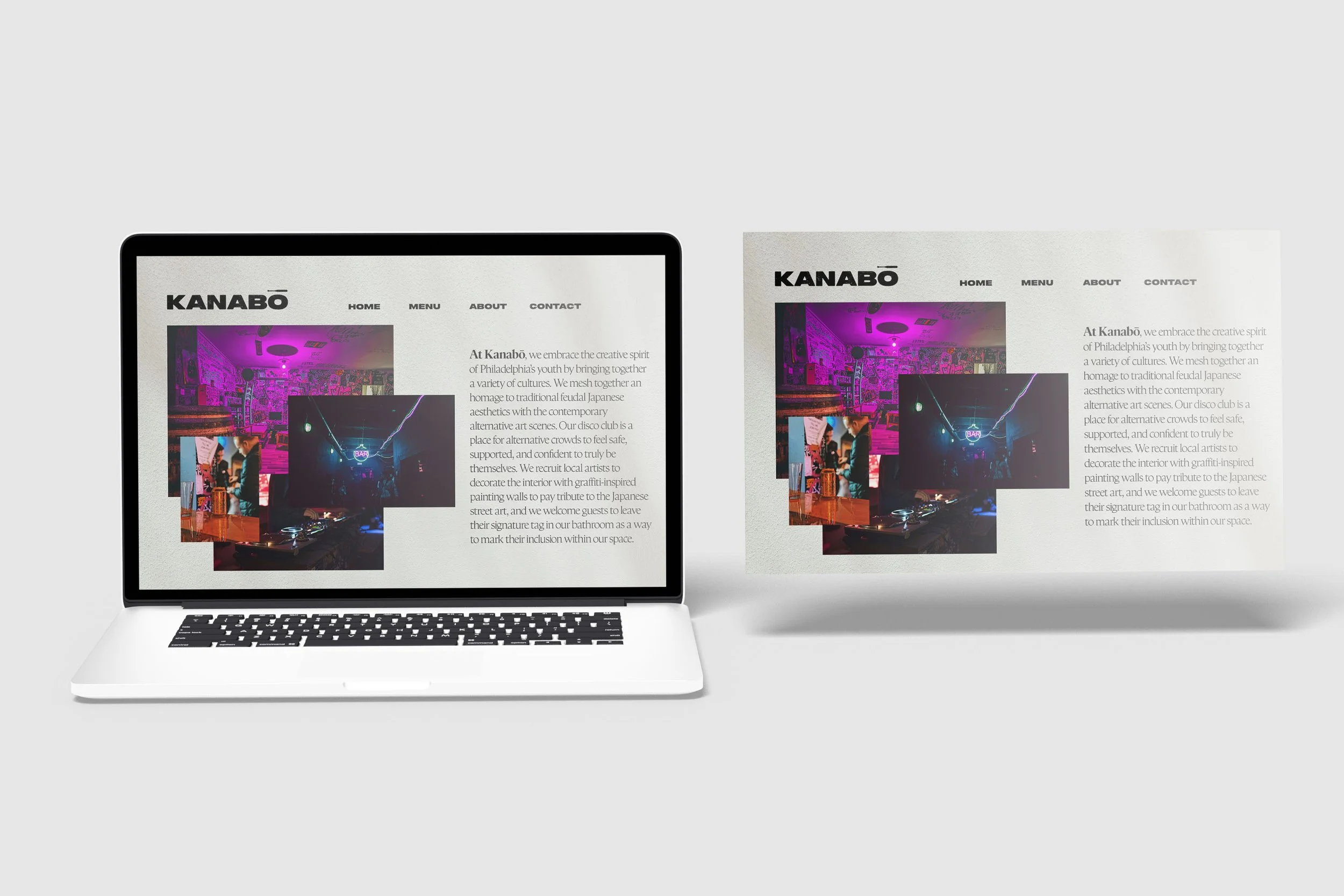
I was tasked with designing the logo, merch, and website landing page, as well as creating mockups to showcase the brand identity.
This project encompassed a holistic approach to branding, including putting together a menu, social media assets, ensuring a cohesive and engaging visual identity.
FINAL LOGOS
A Little Background
Information
The kanabō is a weapon that can be traced back to ancient Japan. Originally it started off as a simple wooden club outfitted with metal studs, and eventually evolved into a more lethal weapon made out of iron and was reinforced with metal spikes.
We decided to make Kanabō a restaurant that doubles as a nightclub as a play on words.
THE PROCESS
We started off by creating a mood board on Pinterest to hone in on the direction we wanted to take this brand in. Due to the Japanese nature of the Kanabō weapon itself, we decided to pay homage to Japan’s street art and Asian woodblock stamps with this restaurant/club’s branding. Below are some of the images we used as inspiration.
Main Inspiration
While working on the mood boards, I was mainly inspired by this woodblock image that one of my partners had stumbled upon and pinned to our Pinterest board. Something that we really liked and kept coming back to was this poster that had a woodblock stamp on it that really encapsulated this “grungy” and “hardcore punk” energy that we were going for. With our direction with how we wanted to be a “grunge” place that didn’t necessarily scream clean and modern, the character and texture of the stamp had a huge role in my design process.
Rough Drafts
Working on this logo was a bit challenging. It forced me to do something different than what I am usually used to doing when it comes to creating logos. I felt as if I was forced to make a logo that was strictly type based. Sure the final logo and some of the drafts have a little kanabō on it, but we really needed something that really fit the brand identity. In the drafts immediately to the left, you can see different types of “stamp-like” typefaces, some of which did have a stamp effect, but not to the extent that we needed it to be. I ended up going with “Peckham Press” which is this really blocky, distressed typeface that reminded me of both the Asian woodblock stamps the group had in our mood board, but also of hardcore show flyers and album covers.
After all agreeing on the typeface I figured there was a way to spice the logo up by adding a weapon into the design. I started with a katana to help as a placeholder, and then eventually created a kanabō club to go along with the logo’s typeface. As seen above with the final logos, I eventually decided to have the kanabō act as the glyph over the “o”.
WEBSITE LANDING PAGE
MERCH
SPECIALTY MERCH
Something that fun that we had to do with this project was come up with a special merch item that could only be found at our restaurant. Being a nightclub that was meant to be based out of Philadelphia, PA, we decided it would be smart to offer some self defense weapons such as a kanabō inspired pepper spray, a holder that doubles as a small club, and the craziest one of them all, the kanabō vape pen.


